Get 40% off annual Pro & Team. Available through Dec 31.
Claim now
40% off!
Get 40% off annual Pro & Team. Available through Dec 31.
40% off!
Like I said in my guide to using pastel colors in graphic design , if you’re using pastel colors just for kids’ products or spring-related events, you’re missing out on a huge opportunity to incorporate these cute pastel colors into any kind of design and make it stand out.
I will share a few examples of pastel color schemes showcased through templates you can find in The Brief for digital or print to understand pastel tones' versatility.
There are two options: you can use colors found on the pastel color wheel without adding any other bright colors, or you can combine them with accent colors.
You can start using any of these templates right away, edit them to your liking, or pick the pastel color hex codes from underneath the designs and start creating your own. If you want to change the colors but don't know exactly what, you can always consult the Pantone pastel swatches.
You can easily create designs with just pastel colors and still draw everyone’s attention. Here are a few template examples, together with their pastel color codes.
Whenever you feel like going pastel all the way, this combination of pastel pink with pastel blue is one of the most charming pastel color schemes you could apply to your designs.
The white from the copy is pointing out the message clearly, without breaking the perfect warmth of the pastel pink and blue mix.
#81C9E1 #B0CCDA #F8C6BF #FFE7E3
This template focuses on different pastel pink shades with black and fresh green infusions to create a harmonious look that attracts everyone's attention.
This pastel color scheme is the perfect example that you don't have to use bright colors to create an engaging visual.
#CD858D #F0D1D7 #DBB6B0 #F0DCDC
Did these colors steal your attention, but you want to experiment with your own design? Go ahead and take the pastel pink hex code and start creating.
Here's yet another example of a perfect template made with pastel pink, this time for a Spotify playlist cover.
The white lines break the slowly darkening of the pastel shade until it gets to dark pastel pink. The final touch is done by the copy written in dark pastel gray to create a soft contrast.
#DCB1B3 #FBFBFB #D69999 #FAE0E1
How else can you portray the delicate look of jewelry and other cute accessories if not with pastel purple combined with pastel pink color and a slightly more vivid pastel orange?
#FFE3E2 #FD6266 #F09B9F #DBC1C4
Who said your logo could catch someone's attention only through bright colors? The example below shows a perfect pastel logo color combination that can be really captivating without being too out there.
This very soft pastel pink color mixed with a dark mustard color and a dark grey is doing its job at being soft and powerful at the same time.
#FFEAE9 #E4CAC1 #9E805C #888483
Here’s another logo example made with very delicate mint green and a pretty pale pastel yellow color. This gentle color combination is creating a lettermark logo that is distinct through its simplicity.
#8DBDAD #FFFFFB #CFE4D9 #94BFB0
This pastel blue is a constant reminder of a sky on a scorching summer day when the heat washes the vivid color of the blue and leaves us with this baby blue pastel.
As you can see below, the light pastel blue works wonderfully with just pastel white.
If you want to recreate something similar, you can take the pastel blue hex code and make your own color combinations.
#9AC3E3 #BDD6EB #F8FBF9 #DDEBF5
Pastel violet, warm pastel yellow, and a frenzy of dark pastel pink make a great frame for the text, which borrows the pastel pink from the background. All of them together are creating an alluring visual, ready to steal all the attention.
#DCC8C9 #EAD8DB #FA9092 #FDCFCF
Here we have a pastel pink color mixed with warm pastel green, a white section that separates the two, and a mustard text that you can turn into a metallic gold color to emphasize your text. And the final result is an eye-catching, delicate business card.
#C2D3CB #F3E4E7 #93784F #E1D3C3
If you’re wondering what pastel colors go together, here’s one beautiful example: a dark pastel green with pastel pink—a perfect combo that works nicely for a flyer design.
#717054 #BFBE87 #F9F8E5 #D3CFC2
A flash summer sale should be represented accordingly: a light seafoam green, pale pastel yellow, and pastel orange. Each color holds a word written in white to keep up with the summer vibe. The background is a dark pastel pink that helps all the other colors come together in a perfect print made for summer.
#F59B9B #7FE7CC #DFE38C #F0CA8C
This visual has a calming pastel background resulting from a mix of pastel pink and pastel orange, perfectly done for its intended purposes, a flyer for a spa day.
The dark pastel gray which the flower sketches and the copy have is in a soft contrast with the background.
#F2D5C3 #CFB4A4 #BCA596 #E5C8BC
You can also mix light pastel colors with dark pastels, like in the example below. This certificate made for print has a frame created with a pastel orange, decorated with solid pastel colors in darker shades.
The white space from this certificate makes room for the copy written in a more vivid pastel orange, known as coral.
#FFE8E0 #F28579 #D2A0A3 #F0ADA4
This design made for a certificate looks like delicious ice cream. The very light pastel orange background is brought to a more vivid part of the color spectrum by combining it with dark pastel green and orange.
#4DB39E #FEA86D #FFF7E0 #FDC391
This card has a lovely pastel green frame put in perfect contrast with pastel orange and coral. The soft insertions of pastel purple flowers make this frame all the more delightful.
The text of this card, which is placed on a white background, is in the same purple pastel as the tiny flowers to help everything come together in a delicate visual.
#A1C8B3 #E1EAEE #E7D9DC #FCA67A
Whenever you want to celebrate a delicate anniversary like Mother’s Day, a monochromatic pastel color palette is always a good choice.
The pastel orange in a darker shade is mixed with a paler one creating a softened look that can soothe anyone looking at this design.
#F4B08B #FFEADC #F4CAA2 #FFE4DC
The light pastel pink with seafoam green is probably one of the most charming pastel color palettes, bringing together the warmth of this very light tint of red with the freshness of the green.
If you wish to create another design with these lovely colors, just take the pastel colors hex codes and make your own card.
#FEE6E6 #B7D7D4 #B7E3E2 #FFEFF0
Another great idea of creating a pastel color palette is using colder tones that inspire minimalism. In the example below, the dark pastel green is perfectly tuned with a lighter one and a baby blue pastel.
#ABB8A6 #D3D4C2 #C0C2AC #ABB8A6
The classic black and white resume can be taken to another level and make a first great impression by inserting a pastel color scheme for a soft splash of colors.
In the following example, there’s a light pastel blue and its complementary pastel tint, which is a pastel orange.
The text is also in a dark pastel grey to keep the delicate look throughout the entire resume.
#FCD1C1 #FCE8E1 #C6DFF7 #EFF8FF
These dampen colors go well in a photo collage, too, because you can use them however you wish and still not overwhelm the viewer.
Here's a combination of pastel white, baby pink, and soft Pantone neon green patched with pastel red all over the colorful eggs.
#F1C8C6 #DFAFAF #EAEAEA #F8E5E4
Pastel tones work wonderfully in combination with darker colors that help accentuate the message or specific elements.
I’m going to show you a few examples, together with their pastel color codes.
Here you have a vibrant blue with its complementary color, orange, on a pastel color background. This design is proof that instead of using a white background, you can go for pastel pink.
#FEE0E2 #FE5925 #F67E5D #08339F
The example below is a splash of warm pastel colors in their soft and neon appearances. There's pastel red with vivid orange and purple, all of them being brought together by the baby pink background.
#E05656 #FFDDDC #F28583 #FEA8A5
In the next template, the lovely pastel purple color is in combination with a light pastel lavender and dark blue for the copy.
These colors are placed on a pale yellow background, creating a gentle contrast.
The different pastel purple hex codes and pastel yellow hex are yours for the taking.
#7C459C #FFCED4 #C1A1D3 #9A6CB4
The next one is yet another template that shows you can use a pale color with its vivid counterpart. The pastel yellow is joined with a brighter yellow and an even greater contrast through dark blue.
#FFEACB #FCB333 #D3DCE3 #012AA7
Your followers will actually feel the summer breeze when looking at this visual made with different orange pastel shades.
#FEE5E0 #CD978B #E4BFB6 #F79177
Dark pastel pink looks good when combined with a lighter one if you want to create a visual that looks professional and clean.
Grab these pastel pink hex codes to create a digital banner that’s eye-catching and balanced.
#FFDFE0 #D3908D #B9605C #FBE5E5
You may be tempted to say print advertising is not that effective. It means you haven't stumbled across a well-made brochure, for example.
The pale pastel orange combined with a bit of pale pink and black as an accent color gives a highly sophisticated look to help this printed ad rise to the product/service it advertises.
#FFF1E6 #F2BB8C #EDDED7 #DCBFB7
I guess we all agree that a beautifully made invitation gets a better reaction from the invited person.
The pastel shades from this invitation bring a graceful look to it, almost impossible to say no to. The pastel violet makes a great team with its darker shade, a pastel lavender here and there, and a pastel white to finish the delicate look.
#F1D5D4 #DBB6C5 #F8F2EF #AA8CA9
Here’s another delightful invitation made with pastel shades, namely soft pale green and pastel yellow on a white background.
#E8C968 #C4D0C0 #63625F #B8B8B6
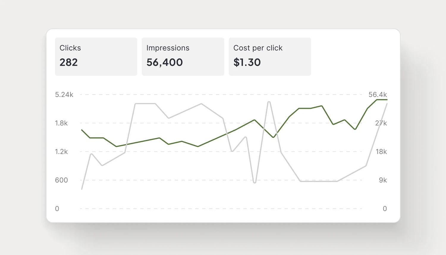
Let's put these insights into action. Build, scale, and automate campaigns with AI-powered workflows.